Disclaimer: Several members of the Krewe of Highland write for Heliopolis and KoH advertised with Heliopolis in its print edition in September and December.
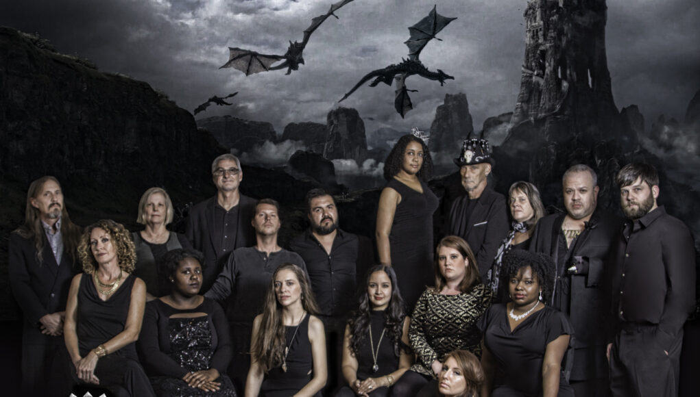
Seventeen faces dressed in black peer impassively at the viewer from the foothills of a range of shadowy mountains in a dark fantasy recently created by photographer Casey Jones. He wowed the Carnival-minded SBC with the tableau he shot for the Krewe of Highland royalty.
“The theme for the KoH Bal Masque (Friday, February 24) and parade (Sunday, February 26) is ‘Game of Throws,’ ” said Krewe Captain Katy Larsen.
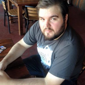
“I already knew that the krewe was doing a Game of Thrones theme,” Jones said. “The source image she wanted to replicate was from the TV show Empire. [They] wanted a tiered look with dragons woven into the crowd. There were nine people in the photo. Each one separately lighted, and probably shot separately and photoshopped into one image.”
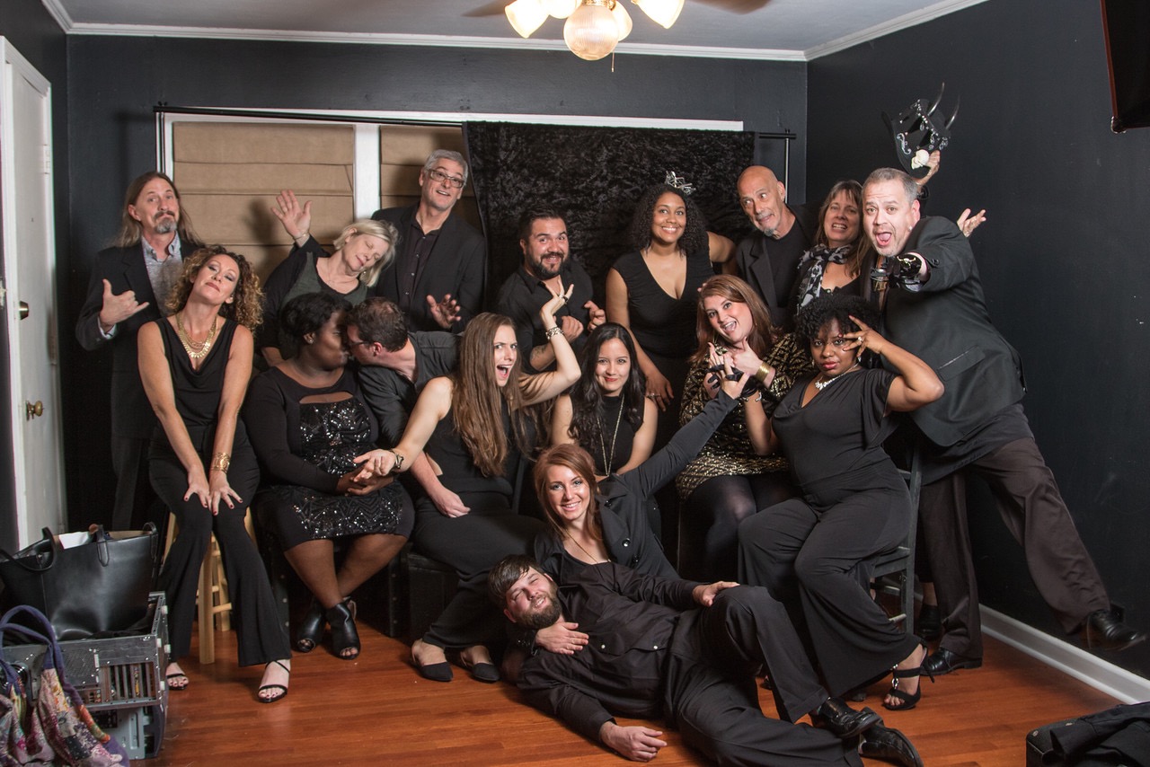
Jones faced a bigger challenge. “She then told me she had 17 krewe members. I knew I didn’t have access to stairs that could hold so many people, so I decided to bring in my mish-mash collection of stools, chairs and other height props.”
“I shot the photo in my home studio. It has black walls and dark wood floor, which I knew would not reflect my strobe lights and give a darker feel. In Game of Thrones we all know, ‘Winter is Coming’. This means overcast skies, a lack of rosy red cheeks and an overall desaturated (reduced color) image. Truthfully, after discussing this, I realize I could have added a little more blue in the tint.”
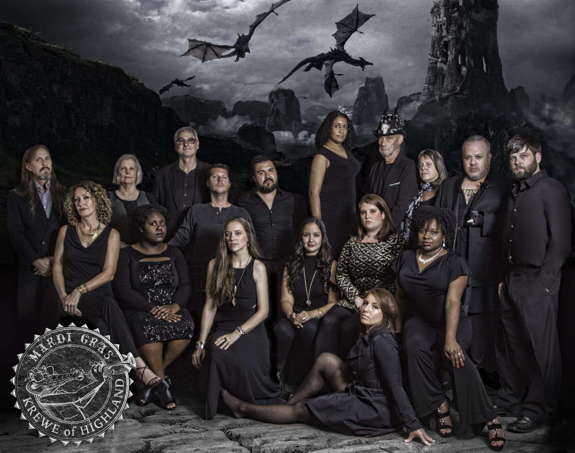
The KoH worked for Jones: “There was a good mix of heights, skin tones and body shapes, and for editing reasons, it was also great everyone was wearing black. I tried to follow the most basic photography rules for groups; tall people in back, and short people in the front. I don’t remember having to direct people too much on facial expressions. I think going into this photo, people had an idea of what they should look like, but as I look at it now, there is definitely some side eye and devious smirks happening.”
“Casey is really great at giving advice on posing and positioning,” said LeVette Fuller. “A head tilt here and there a shoulder turned or a pivot can make a big difference and maybe because he knew most or all of us he was able to get us where he needed really quickly so we were all to advantage as long as we didn’t get goofy. And we are all pretty goofy. But he managed to keep us on track .”
Jones’ use of darkness around his subjects increases the drama and is part of his signature style. “For this photo, I would not have had the space to add any more lights. Thankfully I wanted some dark shadows for this theme. As for my personal photography, I tend to use the shadows to make spaces bigger. Most of my art is shot somewhere on my small percentage of an acre home, so making people think they are looking at a much bigger space is necessary.”
His inspiration and guide is the master of chiaroscuro, Caravaggio. “The Italian Renaissance-era painter Caravaggio was one of the first to really use dramatic lighting in paintings.”
Jones’ compositions are guided by the needs of the job: “Usually it would be pose the model and move around until you get the angle you want. For this shoot I did something very different. This time I used a tripod and a remote shutter release. I knew, as a headshots toronto I would be using several photos, taking heads from one and superimposing it into the one photo I found best. If I had been walking around and zooming in/out, I would have a ton more editing to do to make it look real.”
He shot a Canon Rebel T6i with a Canon EF 24-105mm f/4L IS. The ISO was 100, aperture was f/4.5 at 1/60 second and the focal length was 24 mm.
Sitting at the computer, “I picked the photos that had the faces I wanted. Luckily there was only one I had to work with. I opened the files in raw settings in Adobe Photoshop, and then placed all the replacement heads in the same photo. I then began to remove any blemishes or areas that might make one of the krewe members unhappy about the photo. I hope that worked.”
Jones’ techniques include, “Desaturating the reds and yellows (to a certain percent), upping the contrast, a few other tricks I do, and then I cut out the backdrop around the krewe. The initial idea was to have a dragon in the foreground with everyone, but I couldn’t find something high resolution enough to make realistic. I replaced my wood floor with stone, and the backdrop became the flying dragons and castle (stolen straight from the internet and desaturated to match the foreground). The final touches came in the form of burning some shadows into the image. It helps makes the foreground and background mesh. The final touch was adding a dark vignette border around the image.”
Jones’ use of darkness as a tool of composition created an air of otherworldliness. Dignity and determination emanated from this gathering.
Facebook pages were quickly flooded with hundreds of high-fives for the quality of the image. Karisca Sellers thoughts? “This is frikkin’ rad.”
Janie Landry wrote: “This looks like a shot for a movie cast!”
Does that mean that a quality bar for photographers and krewes is being been raised? The vibe of the Jones / Highland image could become the goal for those who see that Shreveport creatives need to be held to a high standard for Carnival imagery.
Let the good design roll.

